Bundzy
Elegant Monogram G Embroidery Design
Elegant Monogram G Embroidery Design
Couldn't load pickup availability
Elegant Monogram G Embroidery Design: Decorative Script Letter Machine Embroidery File
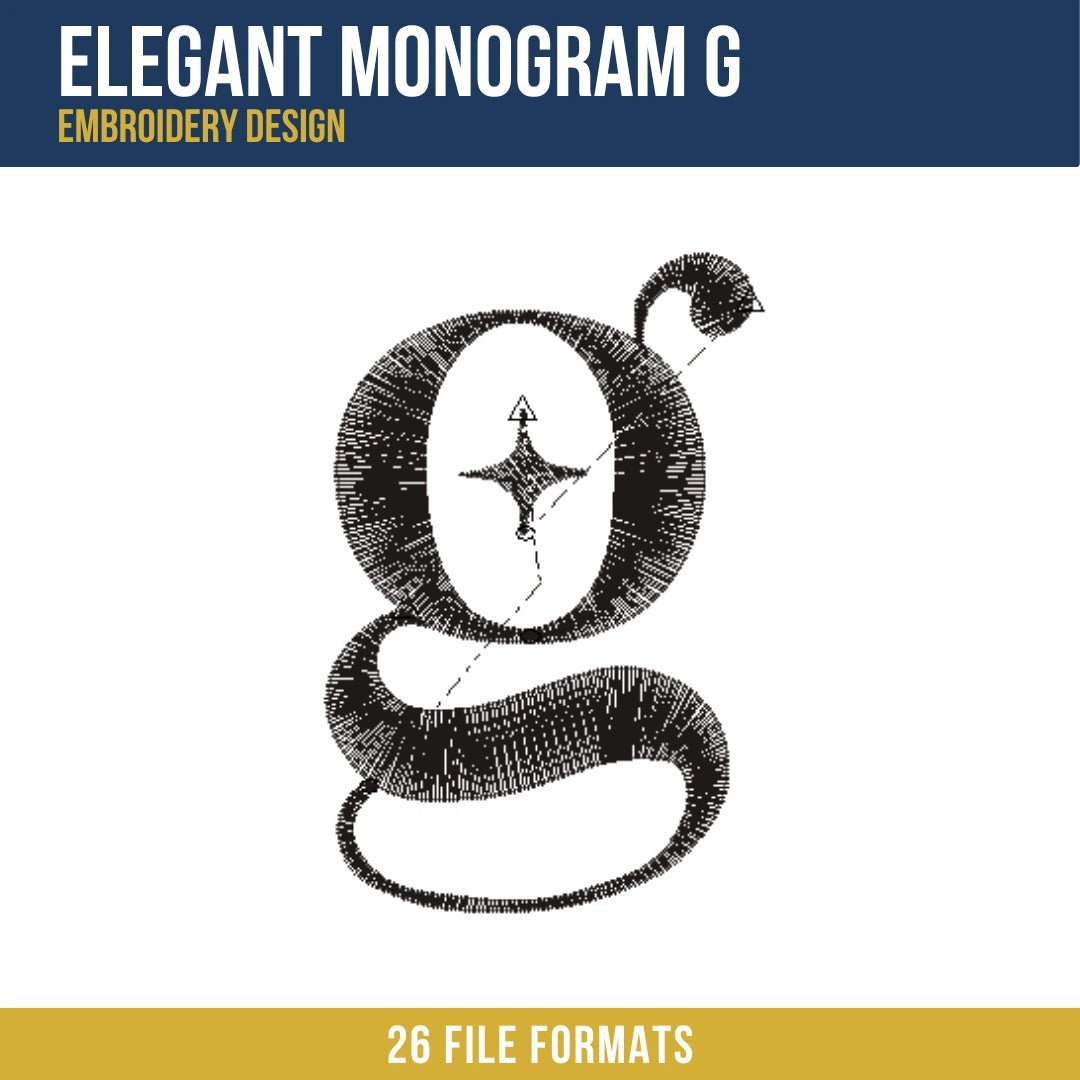
The Elegant Monogram G embroidery design is a stylized lowercase script letter g rendered in deep charcoal black, featuring a calligraphic double-bowl construction with a tight upper counter, a flowing lower loop, and an ornamental upward curl at the top right of the upper bowl. A small four-pointed star accent is placed within the open upper counter of the letter, adding a refined decorative detail at the center of the composition. This design stitches out at 2,256 stitches.
What distinguishes this design from other monogram letter embroideries in an alphabet or initial collection is the double-bowl lowercase g form, which is structurally more complex than any single-bowl letter in the same collection. The upper counter is a closed oval form and the lower bowl is a larger open loop that extends below the baseline, meaning the letter occupies three distinct vertical zones: the upper counter, the middle connecting stroke, and the lower descender loop. Digitizing smooth, consistent satin stitch weight across all three zones and through the tight connecting curves between them, while keeping the letter visually cohesive at under 2 inches wide, is the specific challenge that sets this letterform apart.
Design Details
The upper portion of the letter is a closed oval counter filled with dark satin stitches forming a thick rounded stroke, open at its interior to reveal the white fabric ground within the counter. A small four-pointed star shape sits centered inside this upper counter, stitched in fine dark thread with four tapering points extending toward the compass directions, adding a jewel or sparkle accent without overcrowding the compact counter space. From the upper right of the counter, a thin decorative stroke curls upward and inward to a tight spiral terminal, suggesting an ascender flourish typical of calligraphic script typefaces. The main body of the letter transitions from the upper counter into a broad, smooth lower bowl that curves leftward and then right in a wide sweeping descender, the stroke maintaining a consistent thick body width throughout the curve before tapering to a fine pointed terminal at the lower right end. The overall letterform has the fluid, rounded quality of a high-end monogram typeface, making it well suited for personalised gifts, wedding items, and luxury accessory embroidery.
Size Guide
| Size | Dimensions | Stitch Count |
|---|---|---|
| 1 inch | 1.91 x 2.93 in | 2,256 |
Formats Included
- PES, PEC — Brother, Baby Lock, Bernina
- DST, DSB — Tajima
- JEF, SEW — Janome, Elna
- VP3, VIP, SHV, HUS — Husqvarna Viking
- PCS, PCQ, PCD — Pfaff
- XXX — Singer
- ART — Bernina software
- 000 — Singer/generic
- 100 — Toyota
- CND — Melco/Conde
- CSD — Singer/POEM
- DGT — Barudan
- DSZ — Tajima older
- EMD — Elna
- EXP — Melco/Bernina
- INF — design info
Digitizing Quality
The primary digitizing challenge in this design was maintaining consistent satin stitch width through the multiple tight curves of the double-bowl g construction. The letter contains several sharp direction changes where the stroke curves from the upper counter into the connecting neck and then out again into the lower bowl. At each of these inflection points, the satin stitch angle must rotate smoothly to follow the stroke direction without creating a visible kink or a gap in coverage on the inside of the curve. Each curve segment was digitized with compensated angle rotation to keep the stitch surface smooth throughout the full letterform path.
The upper curl terminal required careful taper management. The decorative spiral that terminates the ascender stroke narrows to a tight coil at its innermost point, and the satin stitch fill must reduce to a very fine width at the spiral center without leaving a blunt end or a thread knot. A controlled gradual taper path was used to bring the fill width smoothly to a single point at the curl center, preserving the calligraphic quality of the terminal.
The four-pointed star accent inside the upper counter was sized and positioned to sit visually centered within the available counter space without touching the inner walls of the letter stroke. At this compact scale, the star points were digitized with precisely tapered satin paths so each tip reads as a sharp, clean point rather than a blunt mark, maintaining the refined decorative quality of the accent.
License
This design is licensed for commercial use on finished physical goods. You may sell items you embroider using this file, including garments, accessories, home goods, and gifts. The digital files themselves may not be resold, redistributed, shared, or included in any digital product collection. Each purchase covers one user and one business.
Instant Download
Files are available immediately after purchase with no waiting and no shipping required. This listing includes 1 size in 25 formats, covering every major embroidery machine brand in a single download. Complete your purchase and start stitching today.