Bundzy
On Call Always Embroidery Design
On Call Always Embroidery Design
Couldn't load pickup availability
On Call Always Embroidery Design: Medical Slogan Machine Embroidery File
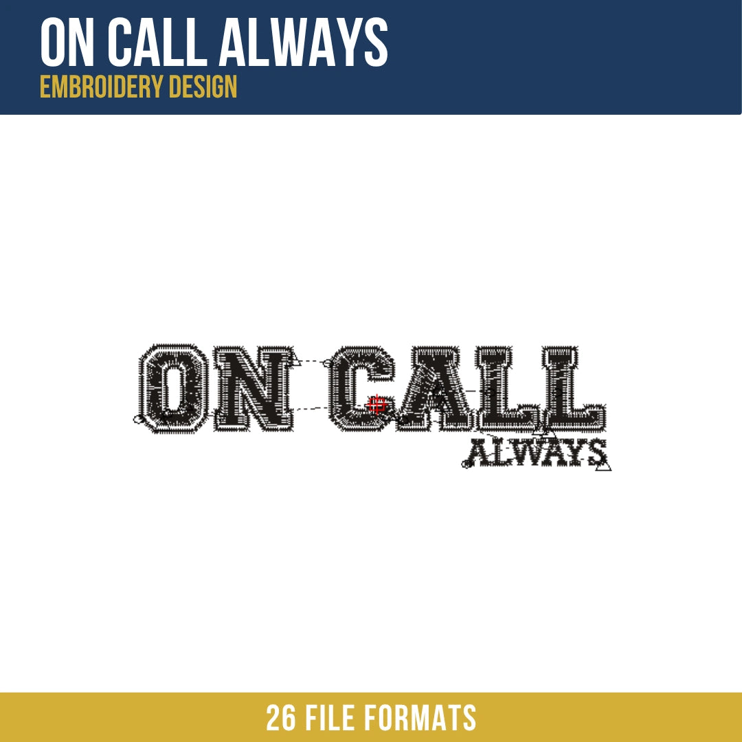
This On Call Always embroidery design is a bold, collegiate-style machine embroidery file featuring the phrase "ON CALL" in large varsity block letters with "ALWAYS" set in a smaller condensed typeface beneath and to the right, all rendered in dark charcoal thread. The main "ON CALL" letters are constructed with a double-outline treatment: a white satin inner border sits between the dark fill body and a heavy dark outer border, giving each letterform a classic varsity inline effect. The "ALWAYS" subtext uses a simpler satin fill without the inline treatment. Total stitch count is 4,180 stitches.
What distinguishes this design from the Nevada Western and other text-based designs in this collection is the three-layer letter construction on the main "ON CALL" text. Where the Nevada Western uses single-layer satin text fills, each letter here is built from three concentric zones: dark outer border, white inline satin ring, and dark inner fill, all within the same letterform. Managing three distinct stitch layers within each character at 3.71 x 0.95 inches without the layers bleeding into each other is the construction challenge unique to this file.
Design Details
The "ON CALL" text dominates the upper and left portion of the composition, set in a wide bold varsity block typeface. Each letter carries the full three-layer inline treatment: the outer letter body is filled with a dense dark charcoal satin fill, a white satin inline border runs inside the fill body following the letterform contour, and the innermost zone is again filled with dark charcoal. The letter O has two open counter voids, one formed by the outer letter silhouette and one by the inner inline ring, both of which must read as clean open spaces on the finished piece. The letters N, C, A, and the two Ls each have their own inline counter geometry. All "ON CALL" letterforms are outlined with a bold dark satin border on all outer edges. The word "ALWAYS" is positioned below and right-justified to the final L of CALL, set in a smaller condensed slab-serif typeface. Each letter of ALWAYS is a simple dark satin fill without the inline treatment, finished with a fine dark outline. The baseline of ALWAYS sits below the baseline of ON CALL, creating the staggered two-line composition visible in the design.
Size Guide
| Size | Dimensions | Stitch Count |
|---|---|---|
| Standard | 3.71 x 0.95 in | 4,180 |
Formats Included
- PES, PEC - Brother, Baby Lock, Bernina
- DST, DSB - Tajima
- JEF, SEW - Janome, Elna
- VP3, VIP, SHV, HUS - Husqvarna Viking
- PCS, PCQ, PCD - Pfaff
- XXX - Singer
- ART - Bernina software
- 000 - Singer/generic
- 100 - Toyota
- CND - Melco/Conde
- CSD - Singer/POEM
- DGT - Barudan
- DSZ - Tajima older
- EMD - Elna
- EXP - Melco/Bernina
- INF - design info
Digitizing Quality
The primary challenge in this design is keeping the white inline satin ring cleanly separated from both the dark outer fill and the dark inner fill within each letter. The white ring is a narrow satin band following the inner contour of each letterform, and at the letter height available in a 0.95 inch tall design, this ring is only a few stitches wide. If either adjacent dark fill layer encroaches on the white ring, the inline effect disappears into a merged dark mass. An edge-walk underlay was applied along both edges of the white ring before the ring fill was placed, creating stitch walls on each side that hold the white satin cleanly between the two dark layers.
The letter O in "ON" presents the most complex counter management in the design. The outer counter void is the space inside the outer letter silhouette, and the inner counter void is the space inside the white inline ring. Both voids must remain open on the finished piece, which means the fill sequence must complete the outer dark fill first, then the white ring, then the inner dark fill, working inward through the layers in order. Reversing any step in this sequence collapses one of the two voids.
The "ALWAYS" subtext sits at a size where individual letter counter spaces, particularly in the letters A and Y, are near the minimum for clean satin rendering. At this small scale the counters were given priority in the underlay sequence, with edge-walk underlay along each counter boundary placed before the letter fill was started, building the fill outward from the counter edge to keep the small openings from collapsing under the pull of the surrounding satin.
License
This design is licensed for commercial use on finished physical goods. You may sell embroidered items made with this file without per-item royalty. Digital files, including all included formats, may not be resold, redistributed, or shared in any form, whether modified or unmodified.
Instant Download
Files are available immediately after purchase. This listing includes 1 size in 26 file formats, covering every major home and commercial embroidery machine brand. Download, unzip, and load directly into your machine or embroidery software.